Visualization
ionique provides qp_trace() for quick matplotlib-based trace plotting and
optional Panel/Bokeh dashboards for interactive exploration.
qp_trace — quick plot
qp_trace() plots a segment tree with different ranks colored and
downsampled independently:
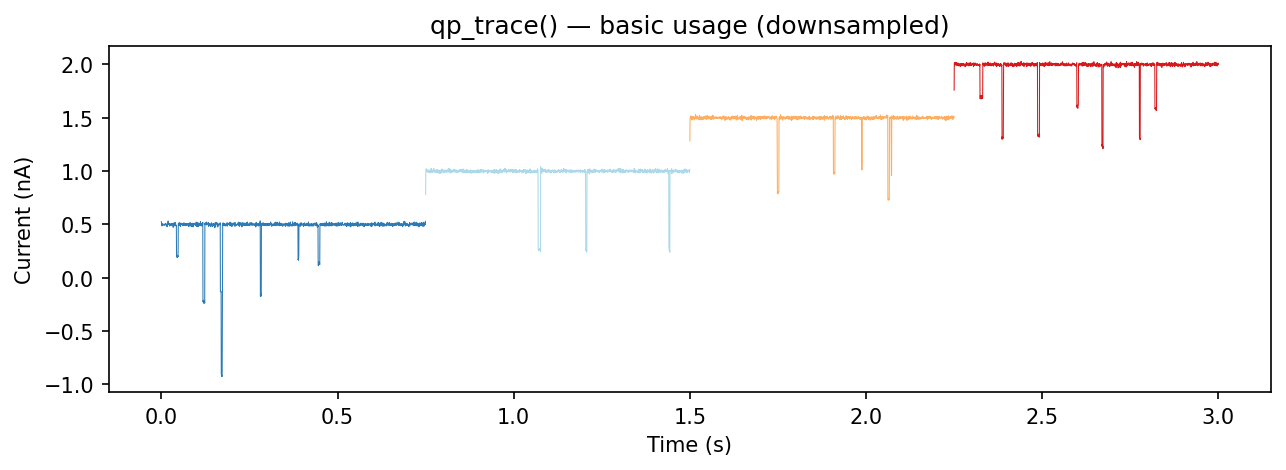
from ionique.plotting import qp_trace

qp_trace(trace)
This plots all "vstepgap" and "event" segments by default.
Parameters
Parameter |
Default |
Description |
|---|---|---|
|
|
Segment to plot. If |
|
|
List of ranks to display. |
|
|
Per-rank downsampling factors. Higher values speed up rendering for long traces. |
|
|
Figure size in inches. |
|
|
Per-rank matplotlib kwargs for styling (colors, linewidths, etc.). |
|
|
Additional kwargs passed to |
|
|
Voltage display mode: |
Specifying ranks and downsampling
# Plot only events at full resolution
qp_trace(trace, ranks=["event"], downsamples={"event": 1})

# Plot vsteps heavily downsampled, events at full resolution
qp_trace(
    trace,
    ranks=["vstep", "event"],
    downsamples={"vstep": 100, "event": 1},
)
Voltage display
plot_voltage=”same” — overlay voltage on the current axis with a twin y-axis:
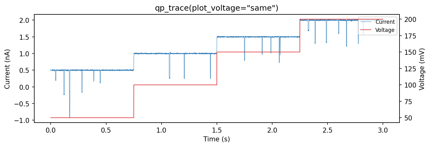
qp_trace(trace, plot_voltage="same")
plot_voltage=”split” — show voltage in a separate subplot below the current:
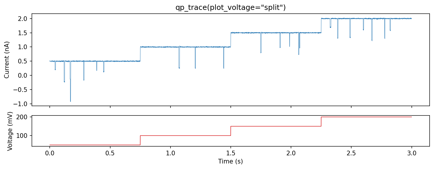
qp_trace(trace, plot_voltage="split")
Styling with ranks_kwargs
Pass matplotlib keyword arguments per rank:
qp_trace(
    trace,
    ranks=["vstepgap", "event"],
    ranks_kwargs={
        "vstepgap": {"color": "#cccccc", "linewidth": 0.3, "alpha": 0.5},
        "event": {"color": "red", "linewidth": 1.0},
    },
)
Downsampling for performance
Long traces (>1M samples) can be slow to render. Use downsamples to plot
every Nth point:
# Plot vstep background at 1/100 resolution, events at 1/5
qp_trace(
    trace,
    ranks=["vstepgap", "event"],
    downsamples={"vstepgap": 100, "event": 5},
)
Interactive dashboards
ionique includes a Panel/Bokeh dashboard for interactive event inspection.
This requires the panel extra:
pip install ionique[panel]
from ionique.plotting import dashboard_event_inspection

# df is a DataFrame from extract_features() with a "wrap" column
dashboard = dashboard_event_inspection(df)
dashboard.servable()
The dashboard displays a scatter plot of events and shows the current trace
for the selected event. It requires a "wrap" column containing the
context window around each event (produced by AutoSquareParser).